Overview
This project focuses on a futuristic and visually captivating design direction for the HNGDH website.
The concept balances cyber-inspired aesthetics with clean structure, so it still feels usable and intentional.
The design leans into bold typography, high contrast, and large hero moments — but keeps layout rules consistent
so the experience stays smooth rather than chaotic.
Design Direction
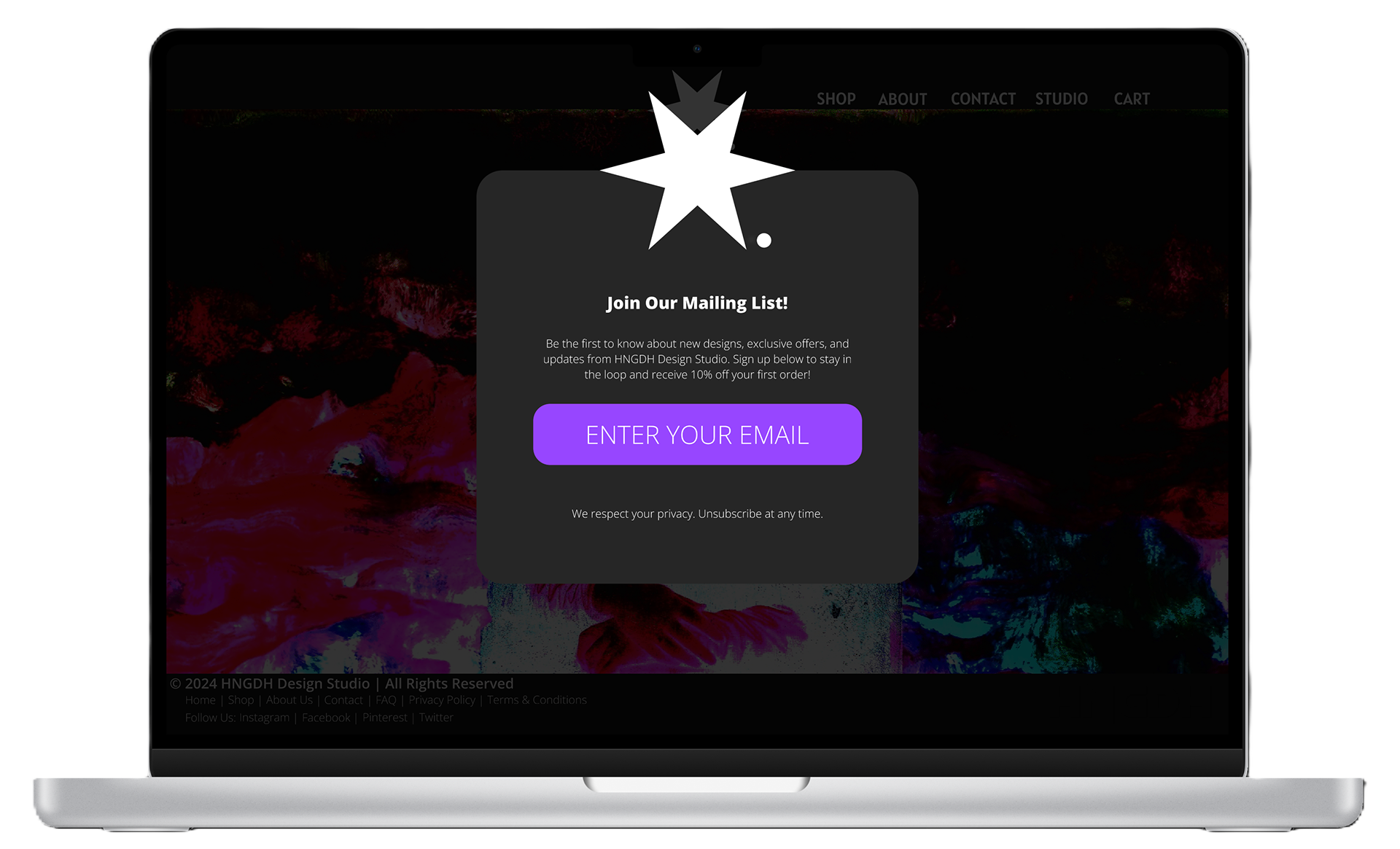
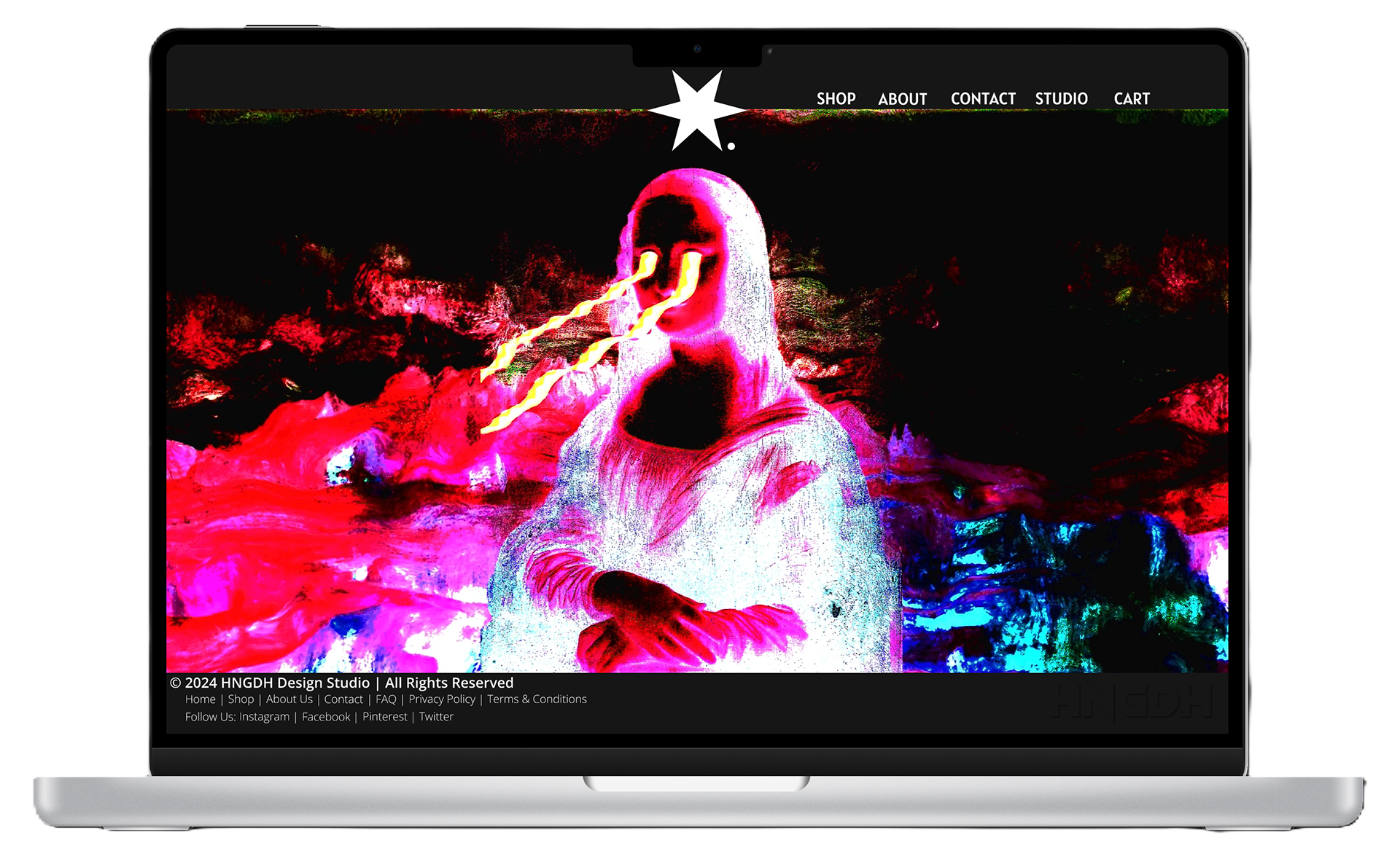
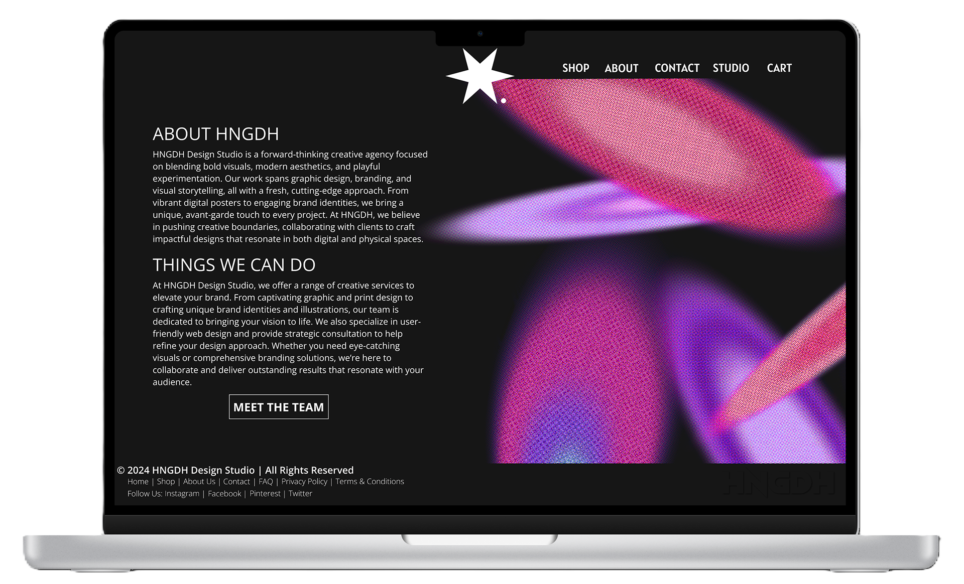
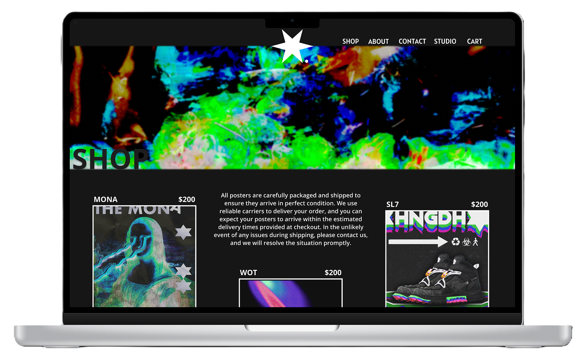
The look is built around strong contrast, minimal colour hits, and oversized elements that feel “poster-like”
inside a website layout.
Hover states and spacing are doing most of the heavy lifting — keeping the vibe futuristic without becoming unreadable.
Layout & Rhythm
Even with an experimental aesthetic, the layout stays predictable.
That’s what makes the big visuals feel “designed”, not random.
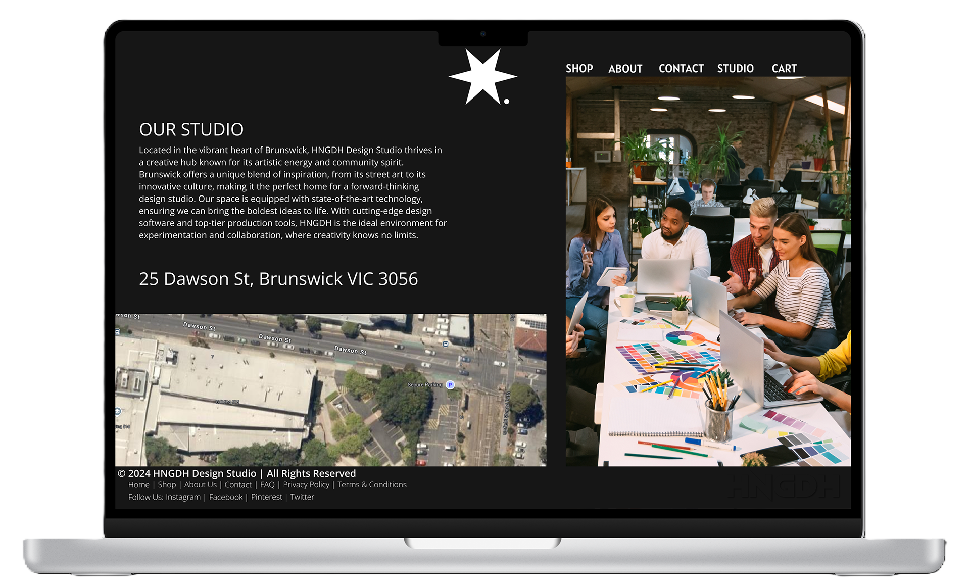
Sections are spaced like a magazine: heavy visual → breathing room → text block → repeat.
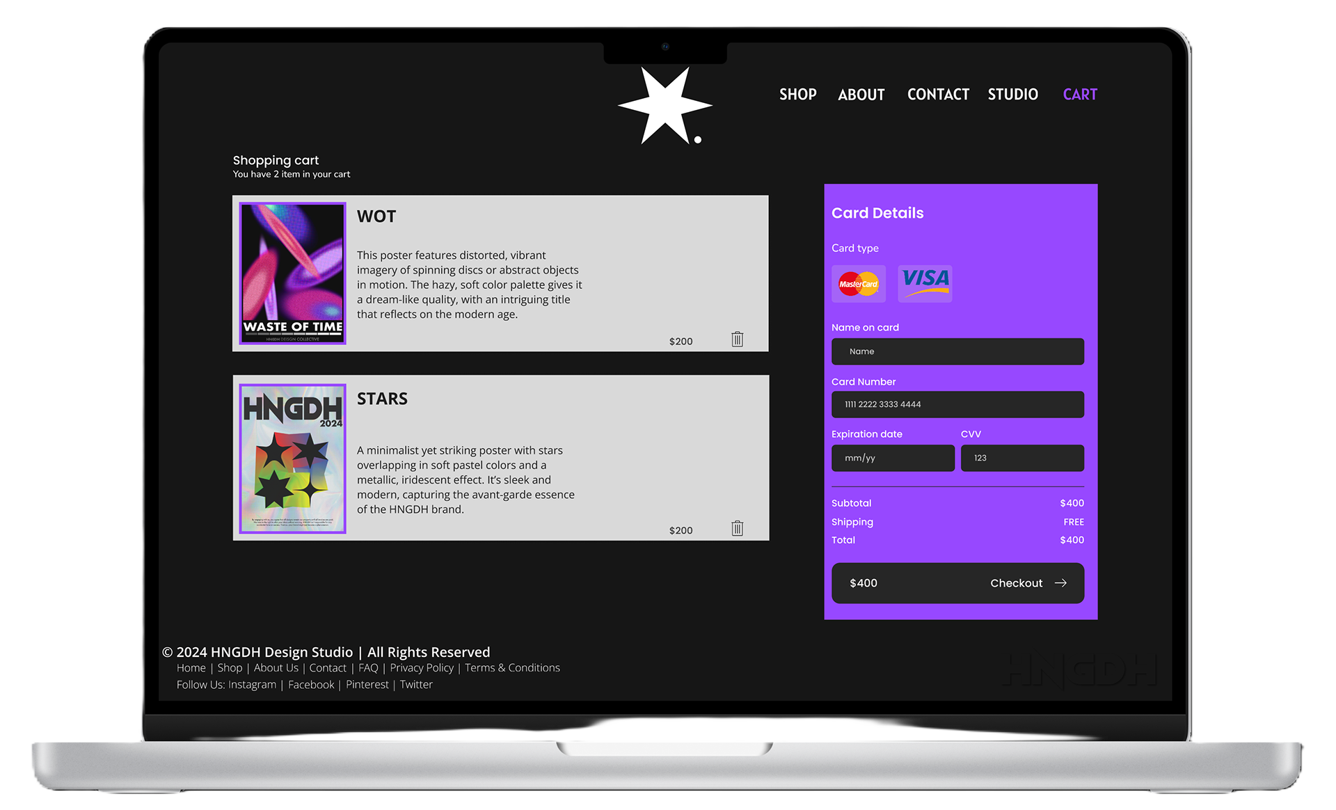
Visual System
The system relies on bold headlines, restrained body type, and a consistent purple accent to tie everything together.
It’s designed to feel like a brand world — not just “a website layout”.
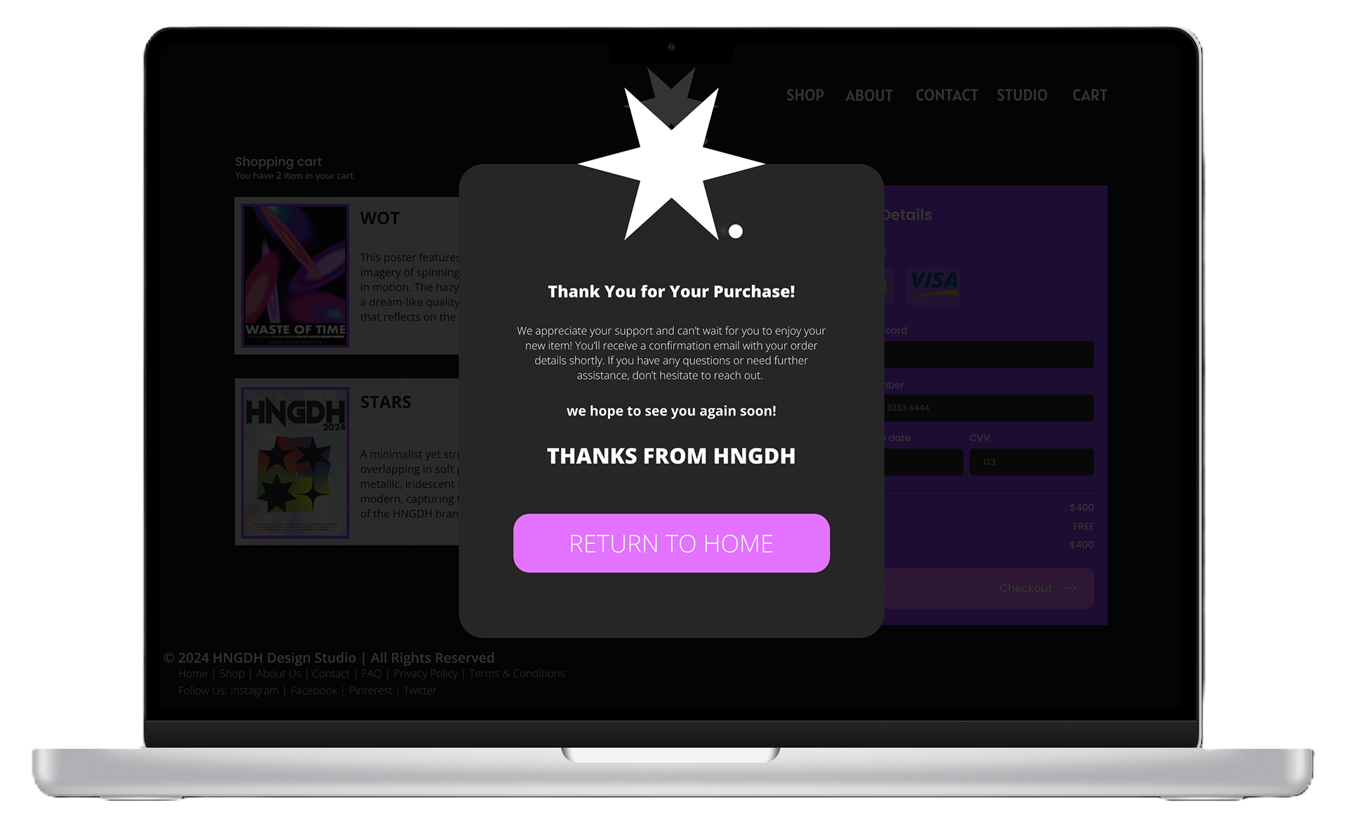
Final Polish
Final screens refine spacing, image weight, and typography rhythm so each page feels intentional
even when the visuals are aggressive.
The result is a concept that feels futuristic, but still structured enough to ship.
What I Learned
This project reinforced that the strongest experimental visuals still need rules underneath them.
When structure is consistent, the wild design choices feel confident instead of messy.
It also helped refine my approach to designing for “vibe”, while still protecting usability.