Overview
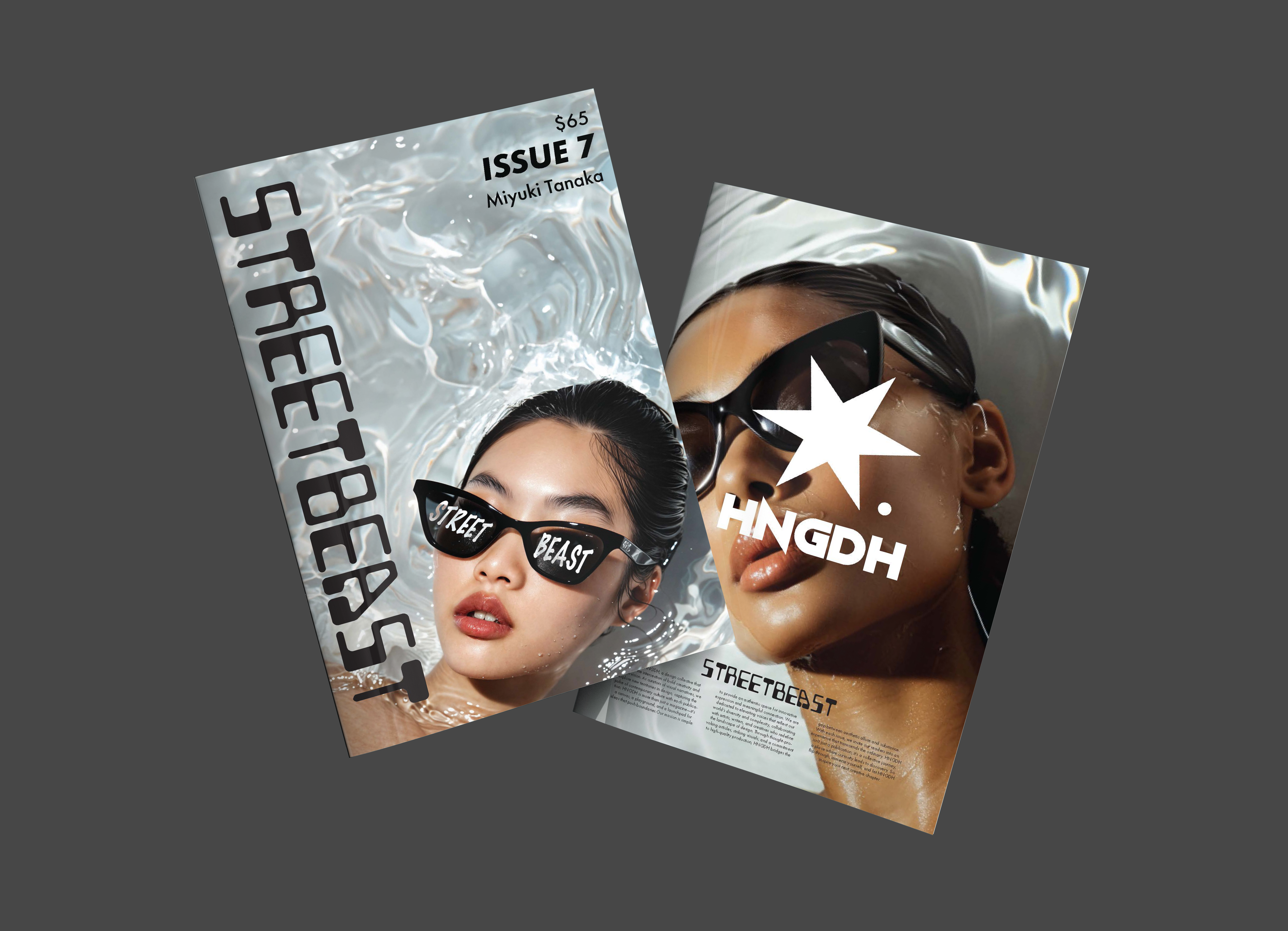
STREETBEAST is a bold and energetic publication designed to capture the spirit of modern fashion and streetwear culture.
It combines high-contrast visuals, innovative layouts, and punchy editorial hierarchy to create pages that feel loud,
modern, and intentional.
The main goal was to push the energy without sacrificing readability — keeping a strong grid underneath so the chaos
still feels designed.
Visual Direction
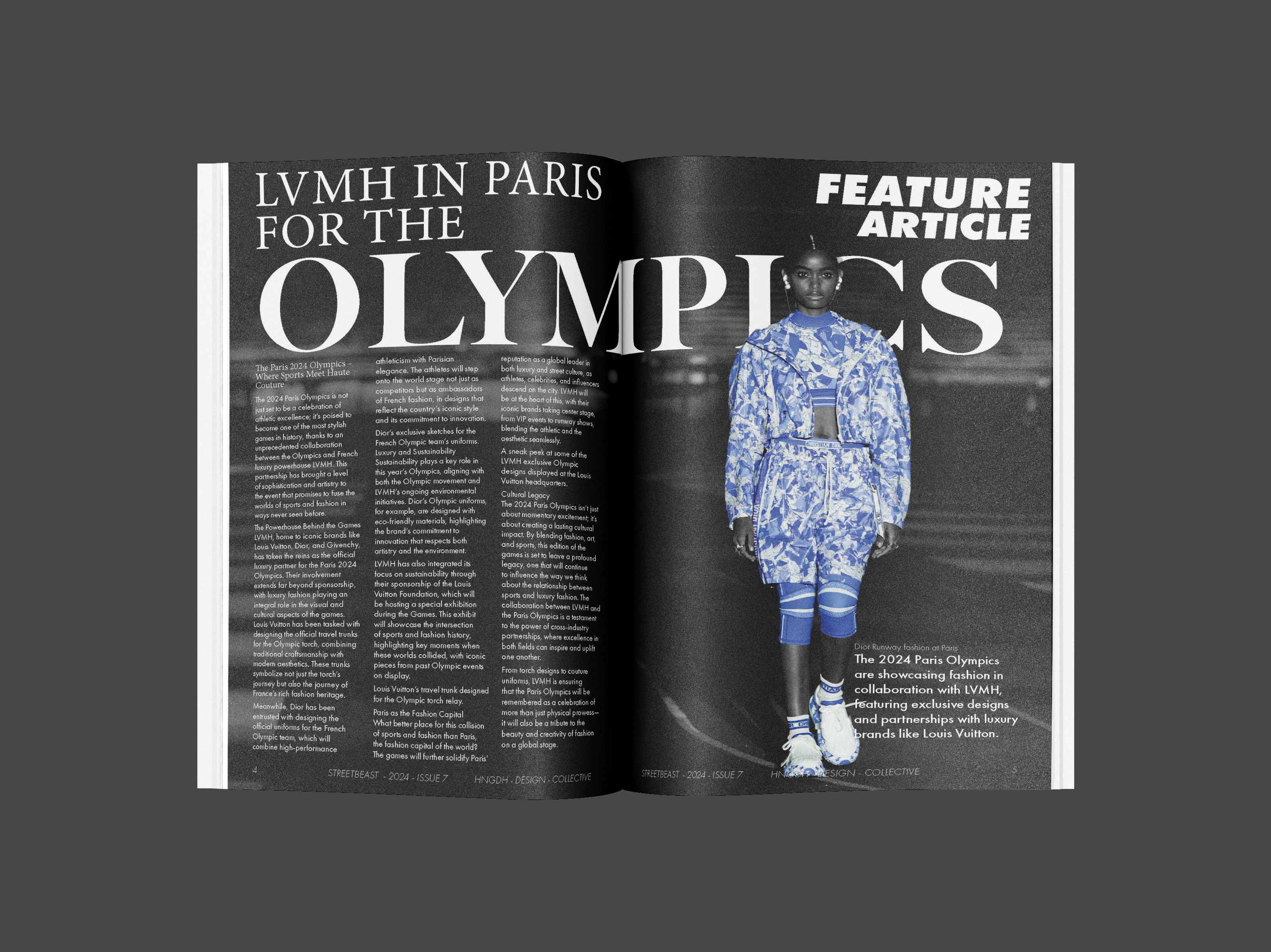
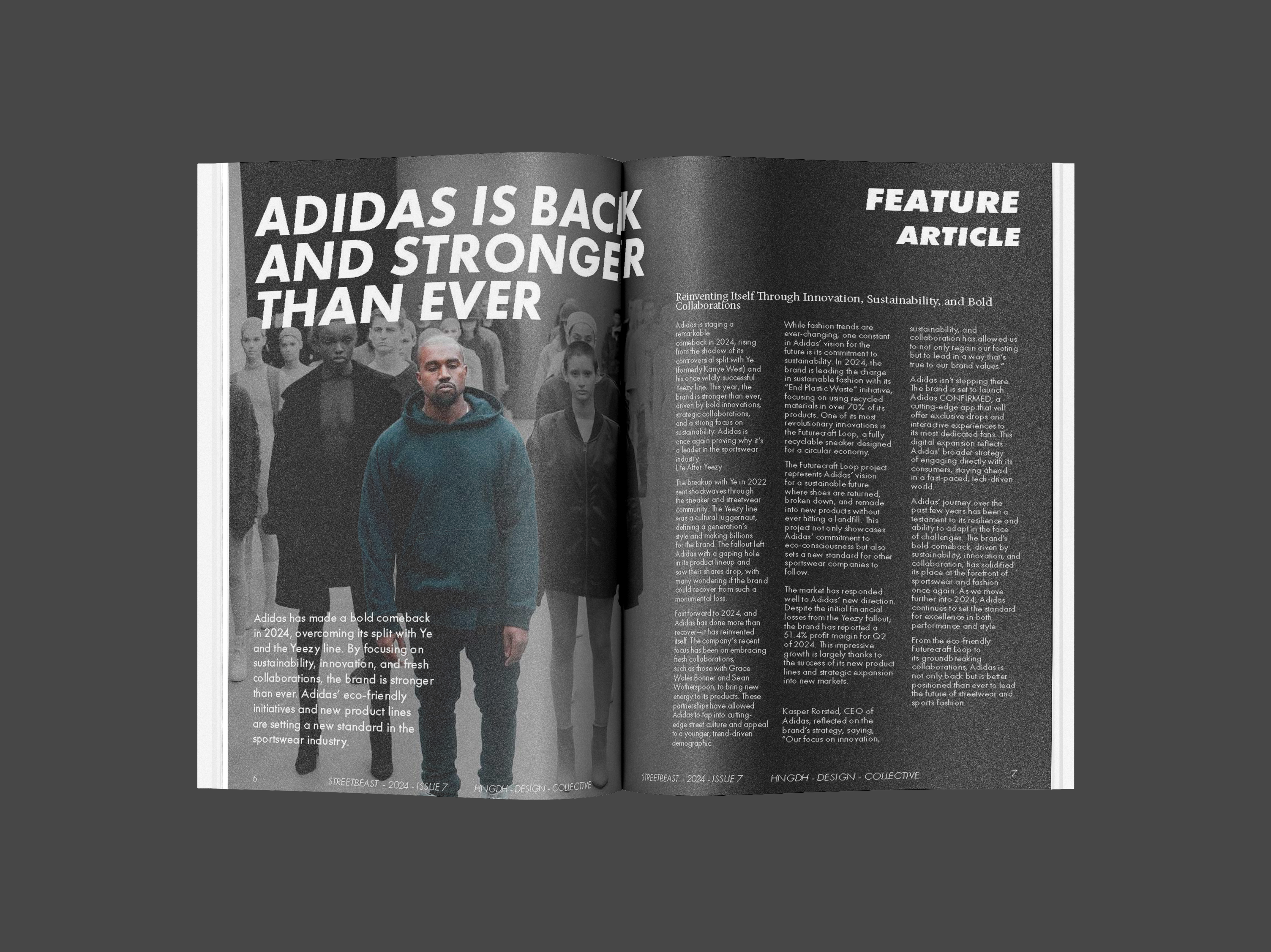
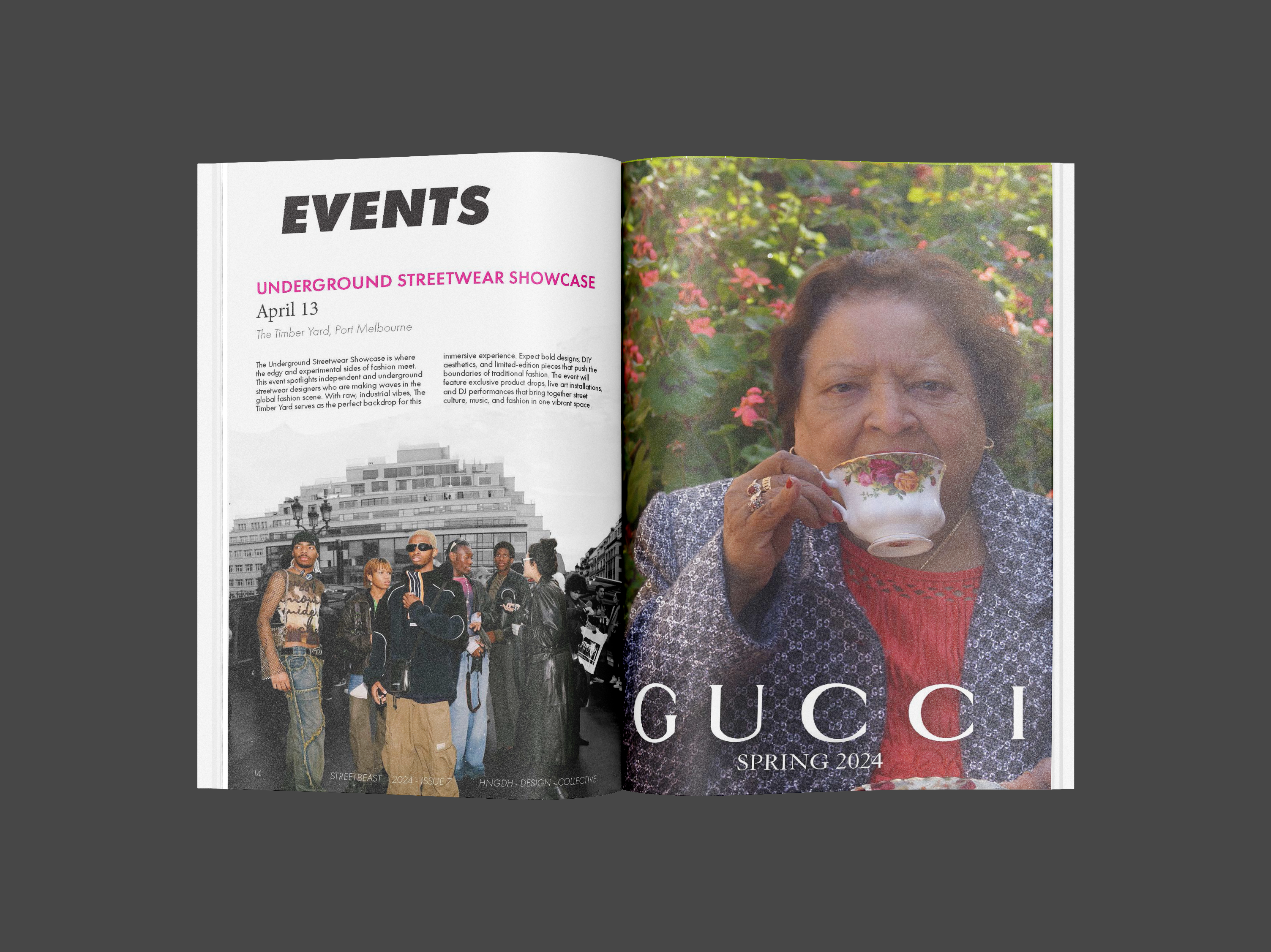
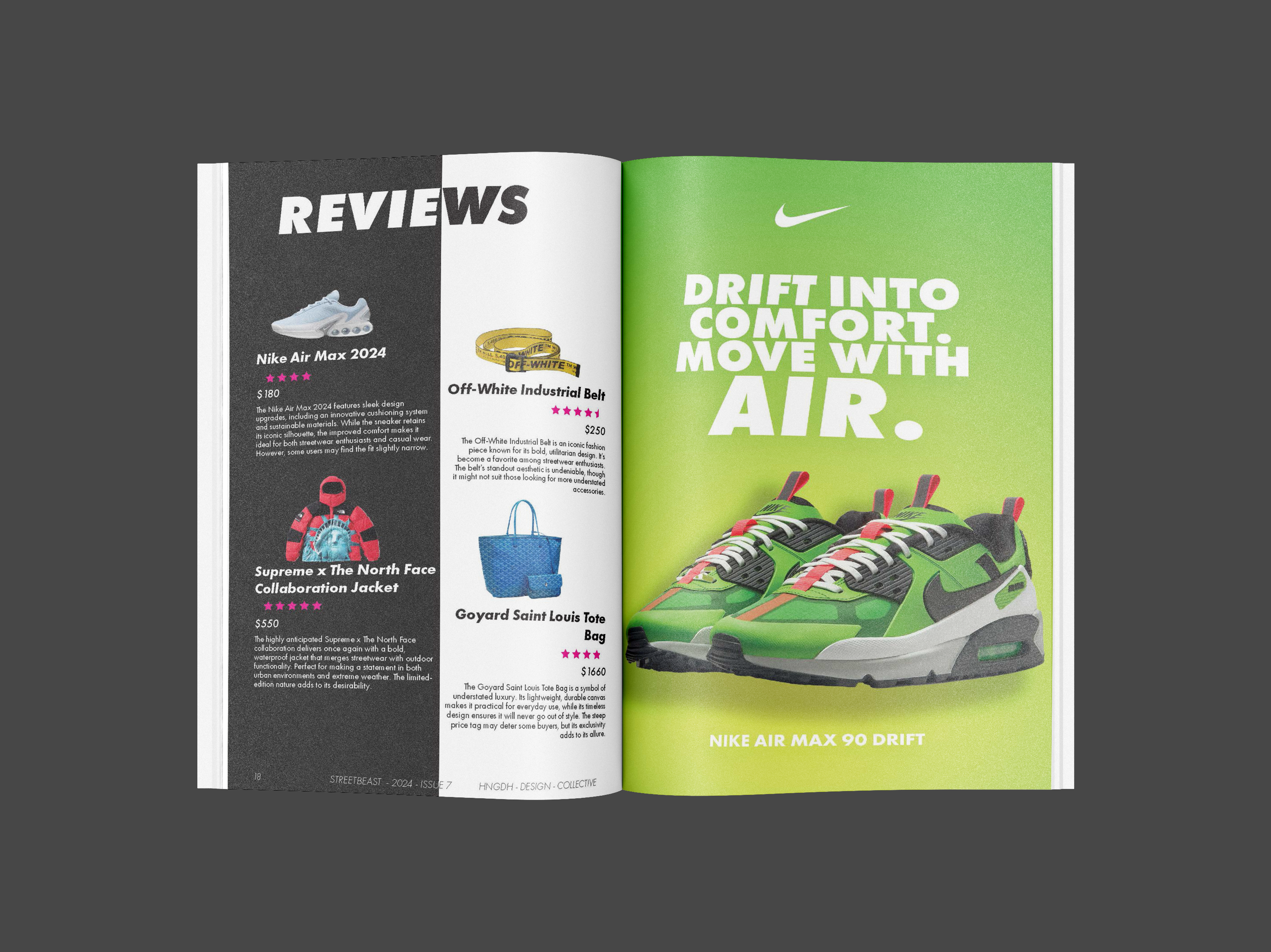
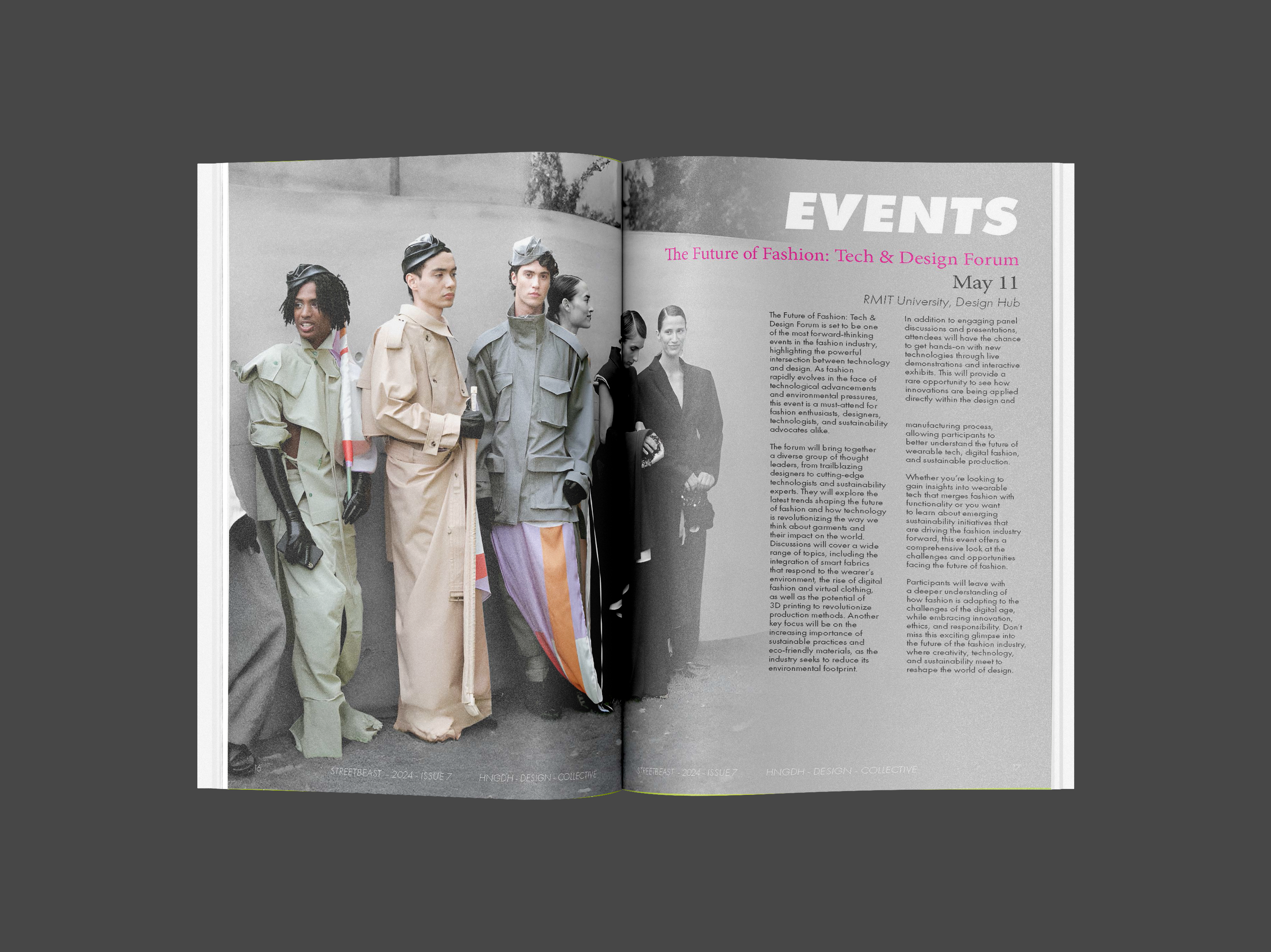
The spreads lean on strong type hierarchy and bold image moments, with contrast doing most of the heavy lifting.
It’s built to feel like streetwear: sharp, fast, and confident.
Layout rhythm is consistent across pages so every spread feels connected — like one cohesive world.
Layout & Hierarchy
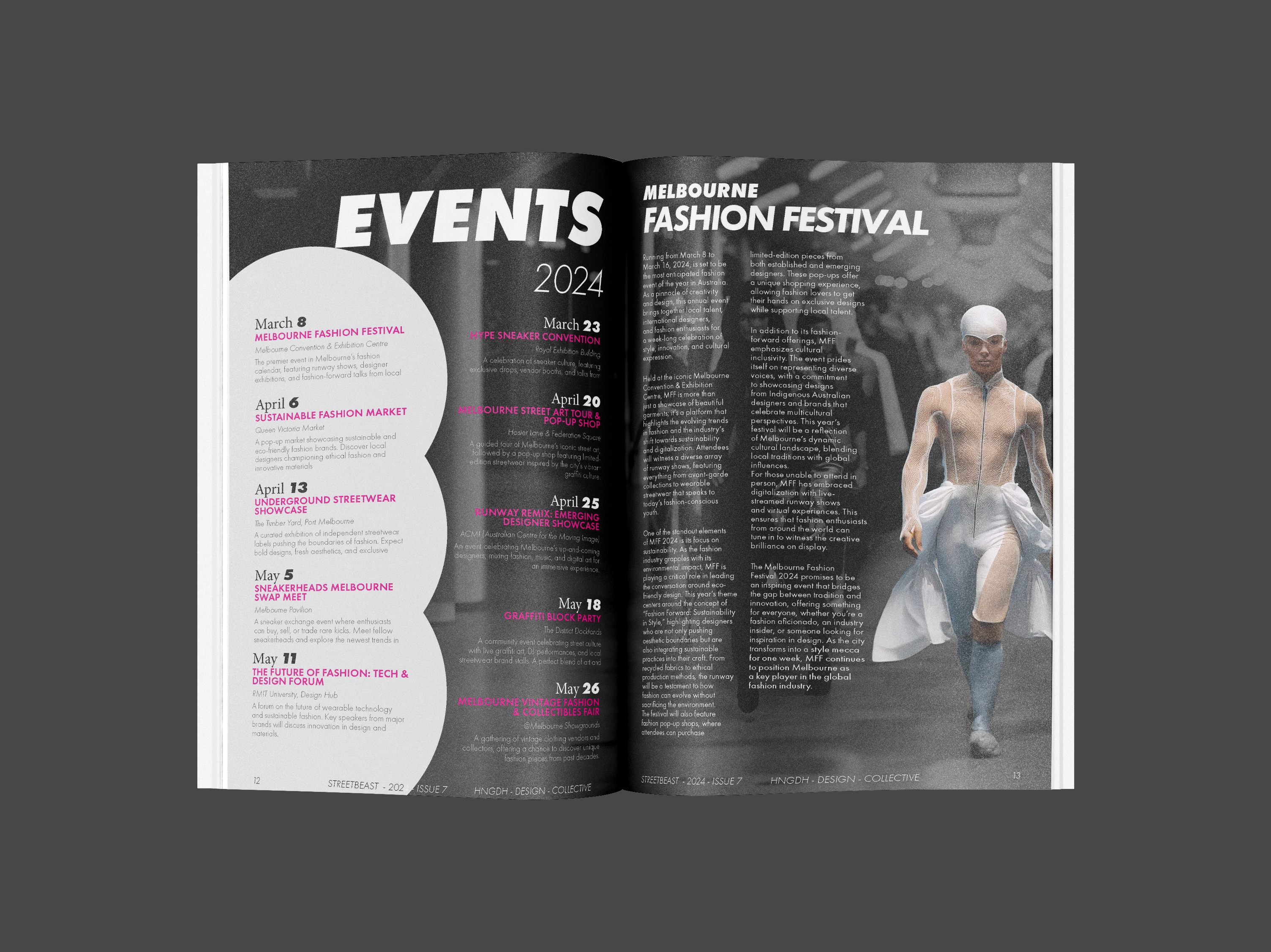
Even when the visuals go hard, the reading order stays clear: headline → hero image → supporting copy → detail moments.
That’s what gives it the “editorial” polish.
Spacing is treated like a design element — it creates breathing room and makes the contrast hit harder.
Key Challenge
Balancing aggression with clarity. The solution was strict grid discipline, consistent margins, and predictable
typographic hierarchy — so the energy stays loud without becoming messy.
Spread Variety
The system is flexible — some spreads are image-led, others are type-led — but they all follow the same rules.
That consistency makes the variations feel intentional.
Crops and scale shifts are used to create tension and movement across the publication.
Final Outcome
The final result is a cohesive set of spreads that feel bold and modern, while still being readable and structured.
It’s designed to scale too — more pages can be added without breaking the system.
Click any image to view it fullscreen and flick through using the arrows.
What I Learned
The biggest takeaway: even “chaotic” design needs rules. When the grid and hierarchy are consistent,
the loud visual choices feel confident instead of random.
This project sharpened my editorial pacing and helped me build a publication system that can grow without losing its vibe.
