Concept & Mood
The direction mixes dreamy gradients and landscape-like shapes with a clean packaging structure, so it still reads as “product” while feeling like art.
Visual weight is balanced to keep the layouts bold without getting messy.
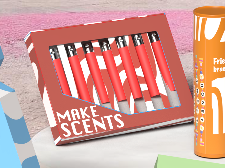
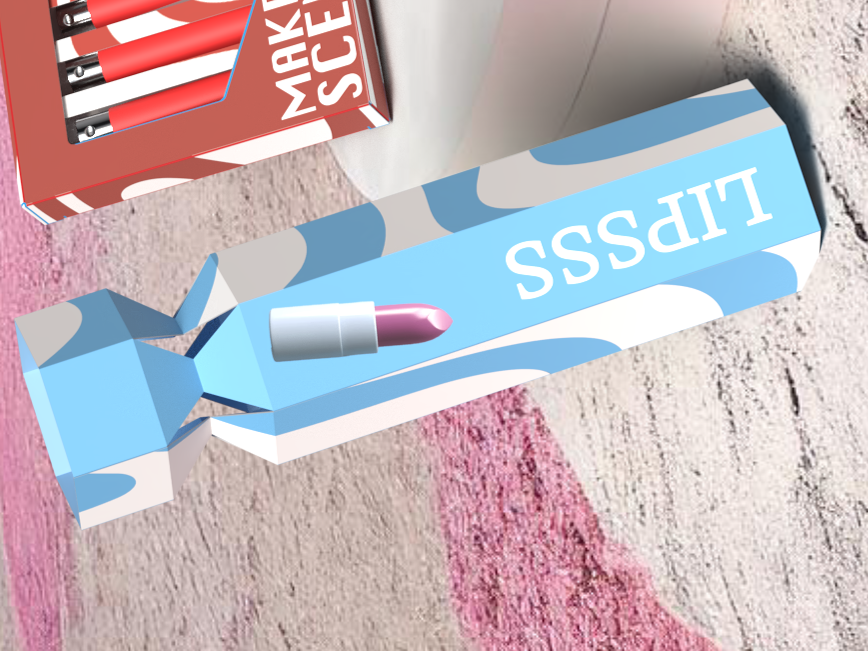
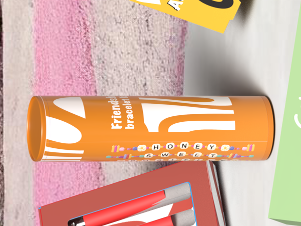
These package designs for Sportsgirl take inspiration from surreal landscapes and vibrant colours. The idea was to treat packaging like a mini poster — something you’d actually want to keep on display, not just throw away.
Click any image to view it fullscreen and flick through with the arrows.
The direction mixes dreamy gradients and landscape-like shapes with a clean packaging structure, so it still reads as “product” while feeling like art.
Visual weight is balanced to keep the layouts bold without getting messy.
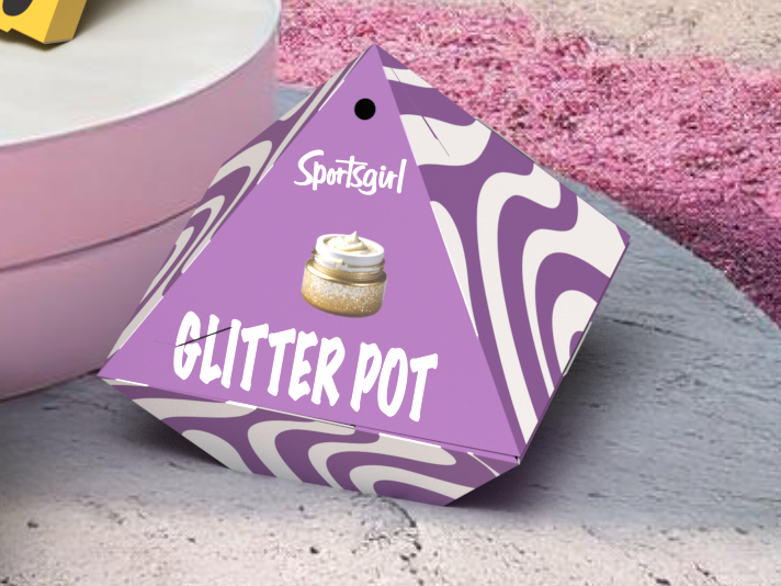
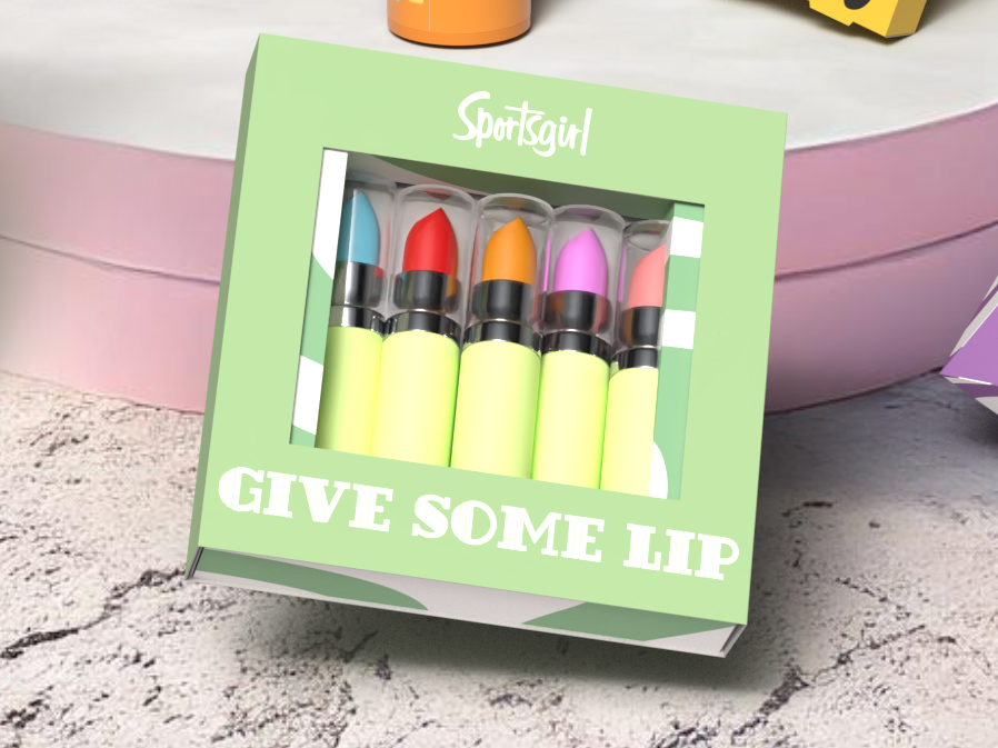
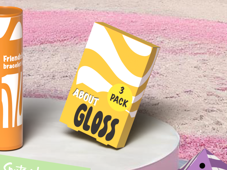
Colour does the storytelling here — bright, punchy palettes that feel playful, while contrast keeps typography readable on shelf.
It’s built to grab attention fast, like a magazine cover.
Making the artwork feel expressive without losing the “packaging” clarity. The fix was keeping a consistent hierarchy for titles + brand marks, then letting the visuals go wild behind it.
Each variant feels unique, but the family still holds together as a set — same layout rules, same pacing, different colour worlds.
That’s what makes it feel like a real range, not random one-offs.
Final touches focus on refinement: spacing, alignment, and keeping the main brand read strong, even when the art is loud.
The result is eye-catching but still “shop-ready”.
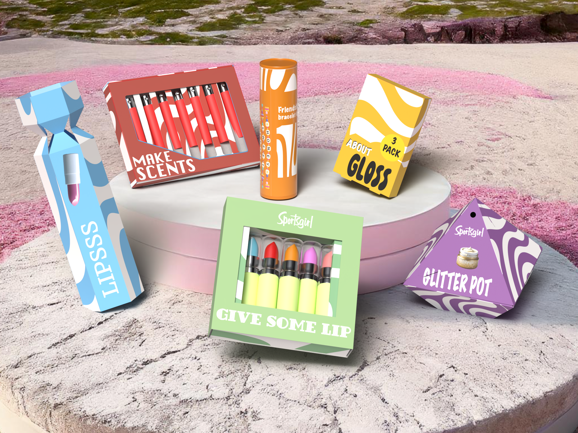
This one was all about balancing art and function: letting the visuals feel expressive, while keeping the packaging hierarchy consistent so it still works as a product design.
It also pushed my colour confidence — making palettes that feel bold but still controlled.